 These pages from 2016 were a different sort of layout package to what I normally do.
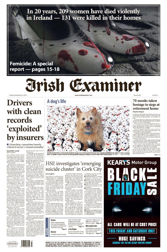
We had a report in from Women’s Aid on the number of women who had died violently in Ireland, looking back over the previous 20 years of the Femicide Watch Project – 209 at that point, with 131 killed in their own homes. It was grim reading.
Our editor at the time, Allan, asked me if I could look at doing something different with representing it. We had the unusual option of making the centre pages of the main newspaper, normally where things like features are in the Examiner book, into a special report for news and of trying to get it printed as a panoramic (where there is no gutter down the middle because the pages are on a single plate).
To give this a chance at working it would have to be a four-page mini section (I’ve lost the PDF of the fourth page). There were, if I recall, two narrative pieces of text and it was suggested to me that I try and use as many faces as possible. I decided that our report should have a cover page before turning into the report proper. This is what I came up with:
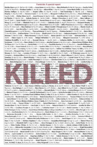
Women’s Aid had compiled all the names, dates, and who killed the women into one list (some killers were awaiting trial at the time). This was bleak reading but essential to the whole point of the report. Pasting them onto the page and seeing how they filled it was cause for reflection. I had an image planned at first and was going to put the names under or around it but then it occurred to me that their names were the point. So I made sure they were, and faded out the word “Killed” behind the list, with each name in bold so you can read them clearly.
At the time, Clodagh Hawe would have been the highest profile of the names along with Elaine O’Hara but it was absolutely essential that no one person be highlighted as a lead image, contrary to typical design rules (which I only use as guidelines anyway). I spent several hours sifting through the archive and found… well, found that we had a great many of the women who had been killed in our database. Not all the image files were the same size, nor were they cropped similarly, so my solution was to run columns of same-size images.
You’ll see if you tap or click on the spread below that the columns are not mirror images of one another, except for the sort of frame of faces I created around the analysis piece, which needed to be as symmetrical as possible to avoid being too distracting to the reader. Generally though the columns have roughly the same number of images in similar shapes, albeit occasionally mixed and matched depending on whether the available photo was a headshot or more upright.
 Regrettably, for reasons I don’t remember, this wasn’t printed properly as a panoramic but ended up with a small gutter down the middle. Thankfully it was the text that took the brunt of this and not a face in one of the pictures, which would have felt unforgiveable.
We don’t normally put content above the Irish Examiner titlepiece but do it when the occasion warrants it, so I made the argument that this was one of those occasions. The stock image I used is deliberately grim, and I had our graphics department convert it to mono but to colour the drops of blood on the shoe a very strong red so they stood out.
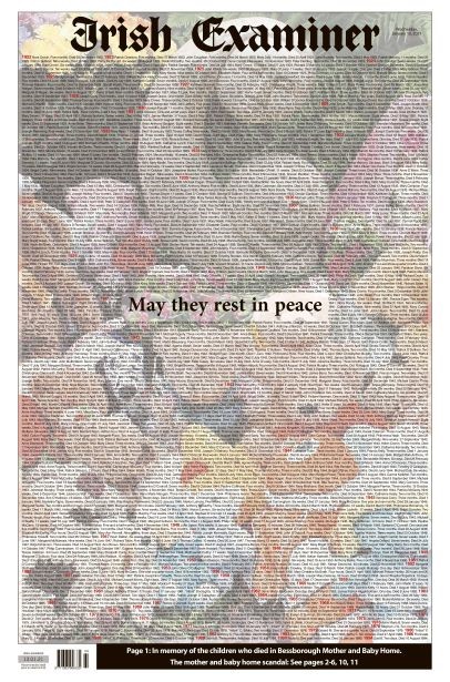
This is one of the packages I’m particularly proud of and the names concept, as I’m sure you’ve realised, was one I revisited in a different form for the Bessborough page.


